
Your message is sending....
A Qatar-based food company which had been doing well in the industry for the past three decades approached Capio with the need of a total rebranding.


We tried to work out several concepts out of which we chose the best that seemed to please both the client as well as the target audience. We chose two shades that can be found inside every bite-sized morsel of falafel, green and yellow that represent liveliness and loyalty respectively.


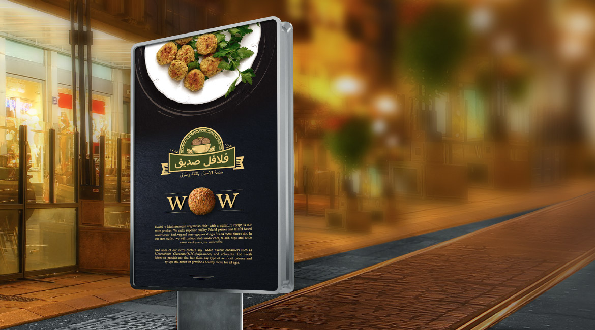


The client had requested for Arabic and English versions for the logo and thus, Team Capio decided to make a single logo that can be used in both the languages.
Being a food branding specialist, Capio believes that every food brand must make every customer drool over it at its very first impression and that is how we approach every food branding project.