
Your message is sending....
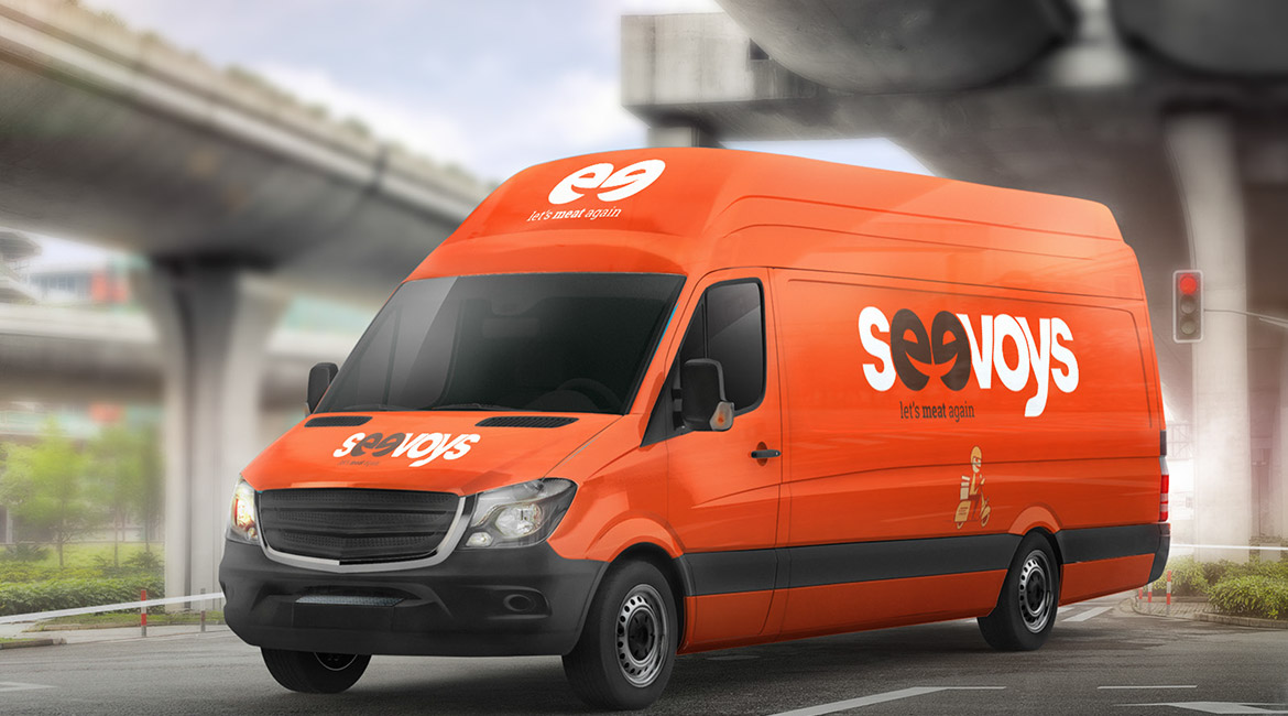
The letters “ee” in the logo is an iconic representation of both delighted customer and happy company, smiling at each other. The smiley created in the middle of the brand name denotes the depth of their relationship and commitment. This concept along with the customized font makes the logo unique. Apart from that, the colour combination used here is much different from the usual restaurant style, which makes the brand look fresh.


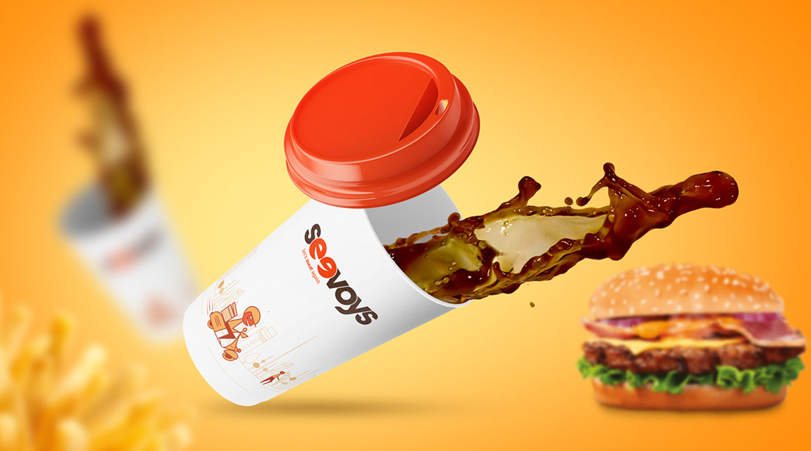
The colour palette is fixed so as to suit hot and spicy range of food which is fresh in its taste. An out-of-the-box colour combination has been used to bring a touch of novelty in the brand identity.


The client was looking for an identity that is relatable and easily remembered by the customers.
The style we followed brings an icon in the brand name itself which is a new concept in food branding.