
Your message is sending....
Brands are created in mind, But re-branding is a strategy to recreate brand image in customers mind, by making sure people love it. Every milestone is just another signpost for those which are yet to be reached. This incredible project was indeed a humbling experience. It was not just to meet the overarching purpose of BEAUTYMARK GOLD & DIAMONDS, but to actually embark upon a journey forward, together towards much better days ahead!


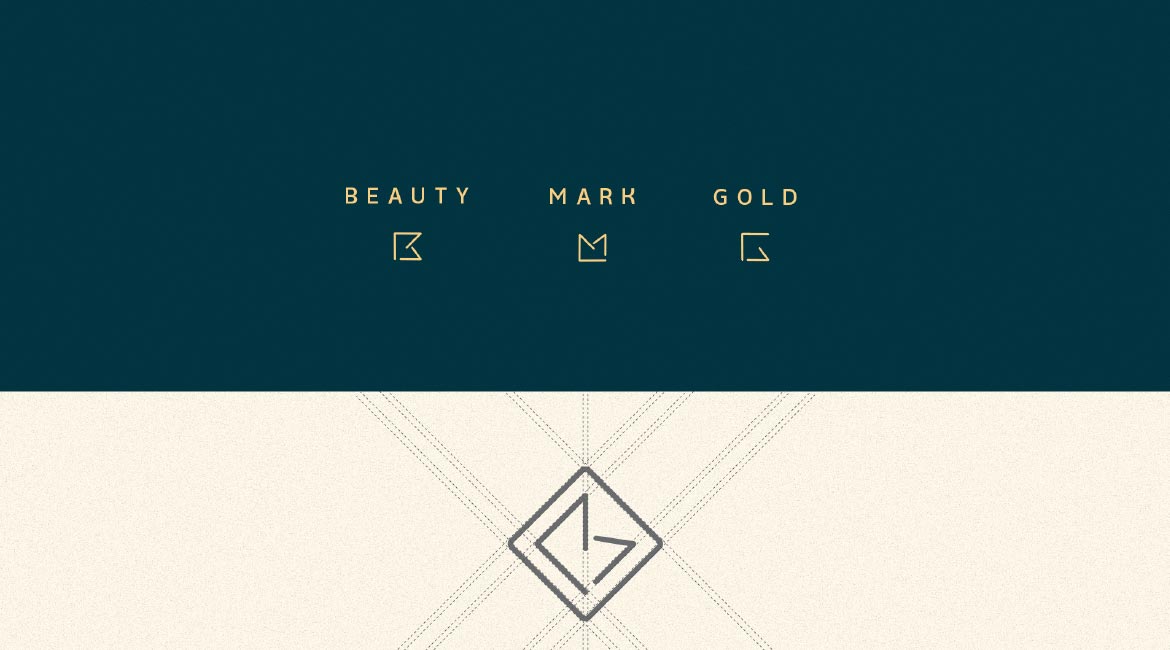
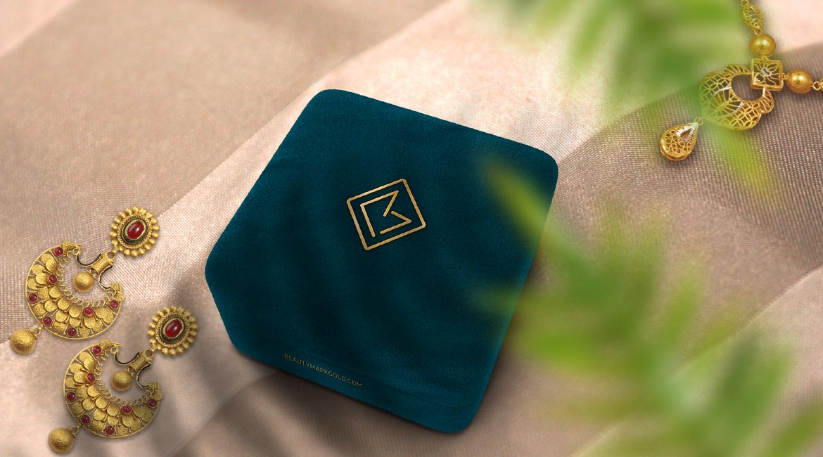
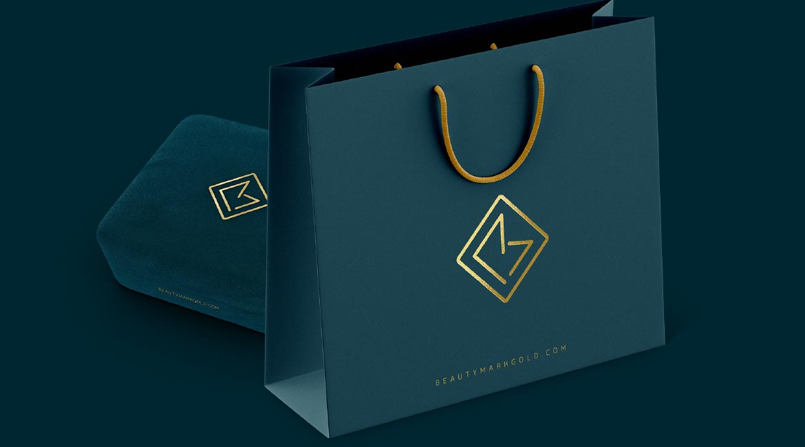
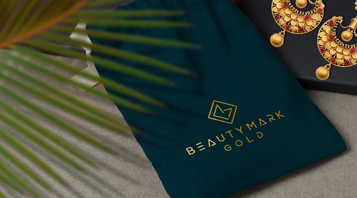
This teal blue and golden color pallete represents royal and beauty segments

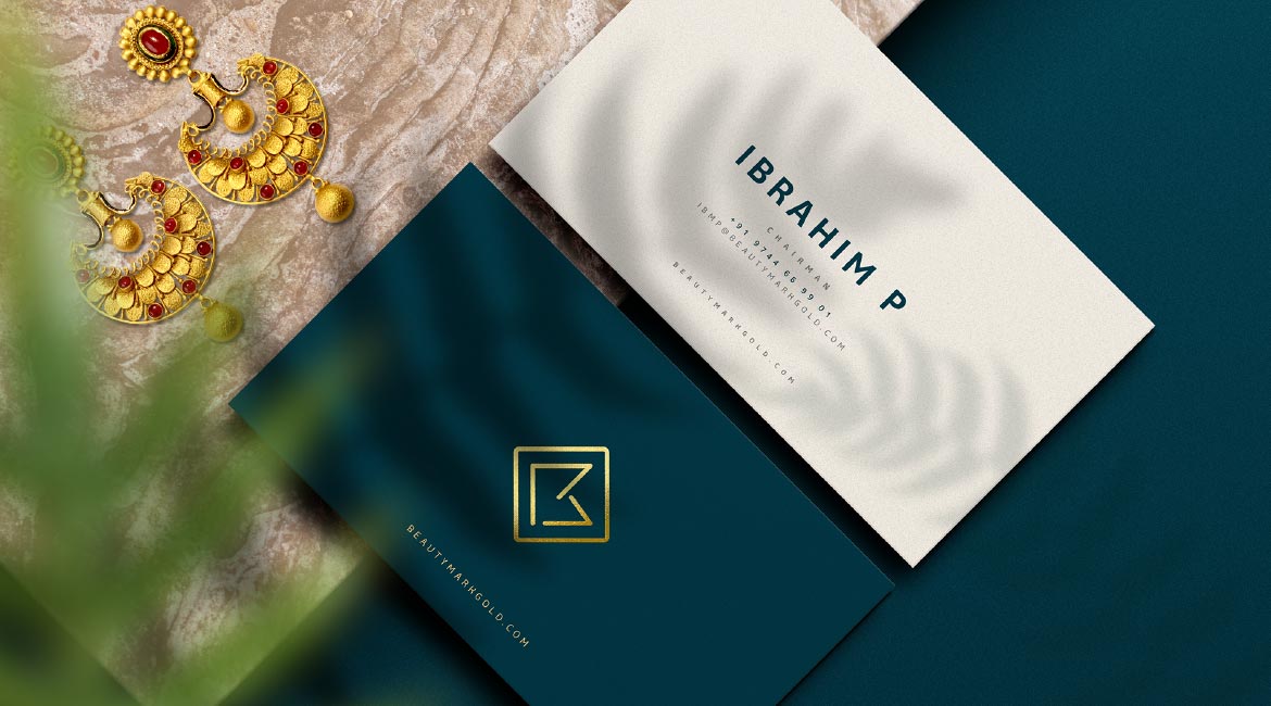

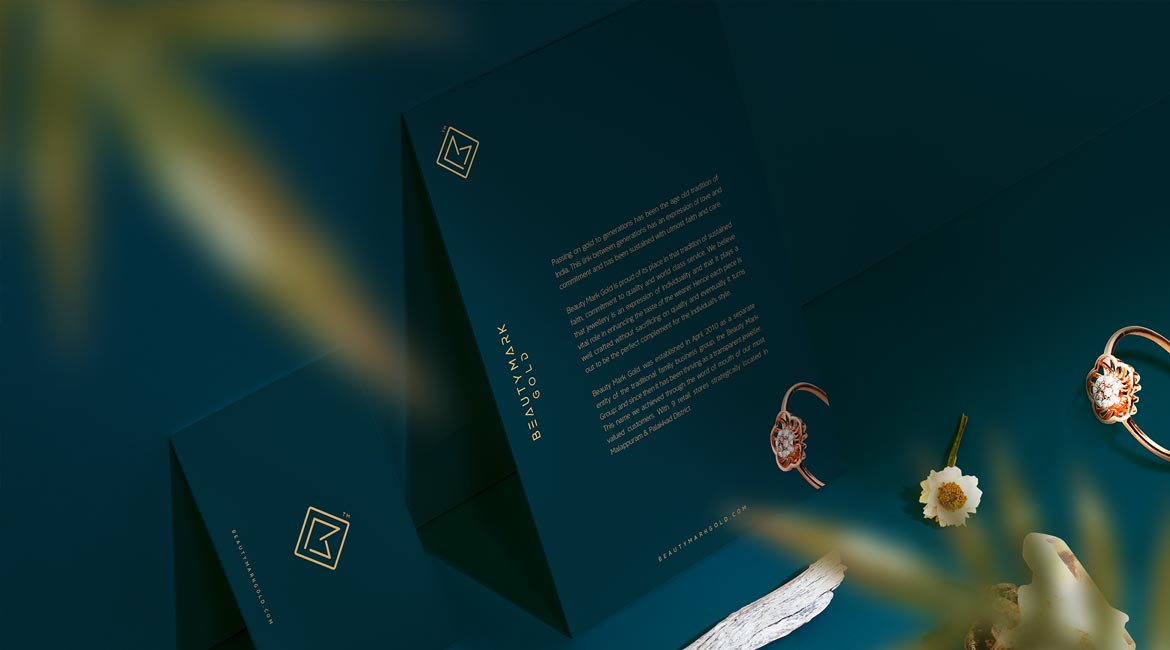
The client was looking for an identity that is relatable and easily remembered by the customers.
The style we followed brings an icon in the brand name itself which is a new concept in jewellery sector.