
Your message is sending....
We puzzled out the ultimate solution to meet all the demands of our client. They were in need of an exceptional branding with both Arabic and English versions of their logo to place their brand internationally. Our creative team took up the challenge and developed an awesome visual identity for the brand. Here you go!

We decided to make an entirely different branding approach for this project based in Qatar, the land which is emerging in association with the upcoming 2022 World Cup. As a result, we picked up two contrasting colours which are not usually used for food brands.


The colour palette was fixed on the basis of a novel thought which brought in two different colours into a wholesome combo which worked out quite well. The colour combination indicates the goodness of both freshness and taste which are the essential qualities of food.


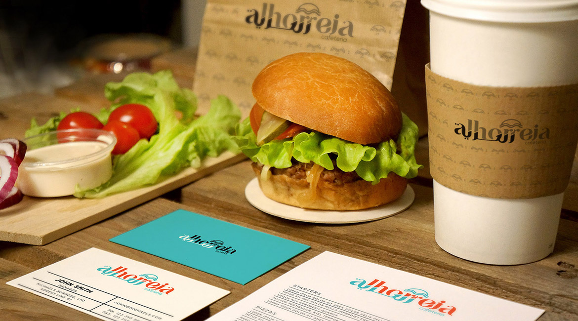


The most important of them was the creation of a logo unit and the choice of colours and styles that suit the brand identity in both Arabic and English.
The brilliance behind the logo design is evident in its incorporation of the brand name in both the languages in a single logo.