
Your message is sending....
Airlines, a journey of good taste and quality service that began in 1996 chose Capio as its branding partner. The choice was not made on a whim and you can see why. Our portfolio is our strength. The client was in need of a complete rebranding as they had plans to expand globally.

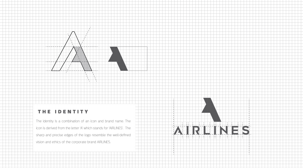
Their demand was a new corporate identity that would explicitly show the brand’s quality and experience in the industry.

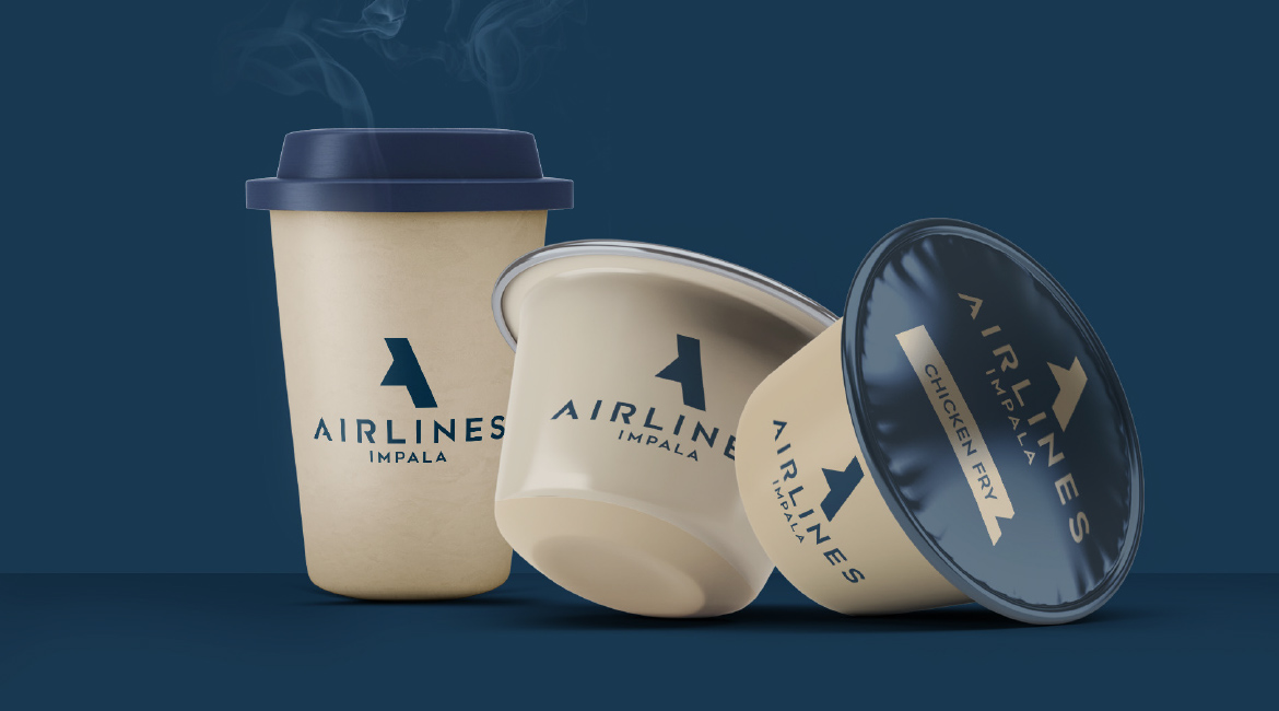
The royal Dark Teal Blue and warm Gold shades keep the brand identity simple, candid and stylish.


The new identity should be crafted in such a way that needs no rebranding for another25 years. It should reflect the brand vision and ethics, and most importantly, it should not restrict the scope of expansion to various business lines in future.
We studied the overall brand strengths, opportunities and identity threats so as to come up with an impactful yet simple identity. After several weeks of intense brainstorming and hard work, we could finally submit an elaborate and gratifying output